
The Unexpected Connection Between Color and Emotion

Color is one of the most immediate visual inputs the human brain processes, shaping everyday moods, psychological responses, and physiological states long before conscious thought takes over. From the stimulating scarlet of an alert sign to the quiet azure of a clear sky, the visual spectrum exerts a continuous, quiet influence over how people feel, react, and navigate their surroundings.
Far from being a simple decorative detail, color operates at the intersection of evolutionary biology, physics, historical symbolism, and cultural conditioning. Unpacking the connection between the hues in our environment and our internal emotional landscape reveals why specific shades can calm racing thoughts, quicken the pulse, or completely alter consumer behavior in daily life.
Key takeaways
- Color perception is a physiological process where photoreceptor cells in the retina convert light wavelengths into neural signals that influence heart rate, blood pressure, and mental arousal.
- Human societies have assigned symbolic emotional weight to pigments for millennia, evolving from ancient sacred rites to classical art and modern psychological therapies.
- Cultural context heavily dictates whether a hue is interpreted positively or negatively, meaning identical shades can signify grief in one society and celebration in another.
- Strategic commercial design and interior architecture rely on proven color pairings to deliberately steer human energy, comfort, focus, and appetite.
The historical evolution of color symbolism
Humanity's emotional relationship with color stretches back to ancient civilizations, where pigments were rare, difficult to manufacture, and intimately tied to cosmic forces. In ancient Egypt, artists and priests utilized blue to symbolize the heavens, cosmic continuity, and the afterlife. Blue pigments represented the eternal protection of the gods and reflected the sacred waters of the Nile. Conversely, the ancient Greeks elevated white as the ultimate visual expression of divine innocence, purity, and sacred light, using unstained stone and white textiles to honor their pantheon.
During the European Middle Ages, colors transformed into a codified visual language that communicated spiritual virtue, social hierarchy, and moral standings. Society used pigments to immediately signal social status and emotional intent:
- Red: Associated with intense passion, physical courage, and the supreme authority of royalty and high-ranking nobility.
- Black: Carried solemn associations with spiritual humility, servitude, and formal bereavement.
The dawn of the Renaissance dramatically expanded the emotional and narrative potential of color. Masters such as Leonardo da Vinci, Michelangelo, and Raphael moved past rigid symbolic conventions, pioneering nuanced blending techniques that rendered realistic human anatomy, dramatic depth, and luminous ambient light. By carefully balancing shadow and illumination, these artists captured delicate internal psychological states across their subjects.
This technical foundation paved the way for the later Romantic period, which prioritized emotional intensity, individualism, and the raw drama of the human imagination. Writers and poets seized upon vivid chromatic metaphors to stir deep emotional currents. Literary icons including William Wordsworth, Samuel Taylor Coleridge, and John Keats wove color imagery throughout their poetry, utilizing visual tones to invoke heavy nostalgia, deep melancholy, and sensory richness.
Far from being a mere decorative backdrop, color operates as an unspoken language that directly shapes human biology and emotional balance.
The biology and physics of color perception
To understand why colors trigger emotional reactions, one must examine the physics of light and the mechanics of the human eye. In physics, visible light represents a narrow band of electromagnetic radiation, with the primary colors of light defined as red, green, and blue. When these primary wavelengths mix at varying intensities, they produce the full spectrum of hues visible to the human visual system.
When light waves enter the eye, they strike the retina, a delicate layer of neural tissue located at the back of the eyeball. The retina relies on two distinct classes of photoreceptor cells to translate optical information into biological messages:
- Cones: Concentrated primarily near the center of the retina, cones function in moderate to bright light conditions and are responsible for high-resolution color vision. Humans typically possess three distinct types of cones, each sensitive to specific ranges of wavelengths corresponding roughly to red, green, and blue light.
- Rods: Far more numerous than cones, rods cannot detect distinct colors. Instead, they excel at detecting low levels of illumination, subtle contrast, and physical movement, enabling human vision in dim and nighttime environments.
Once rods and cones absorb light photons, they generate electrical impulses that travel along the optic nerve directly into the visual cortex and surrounding neural circuits. Crucially, these pathways link to the limbic system—the brain's emotional control center—and the autonomic nervous system, provoking rapid biological adjustments.
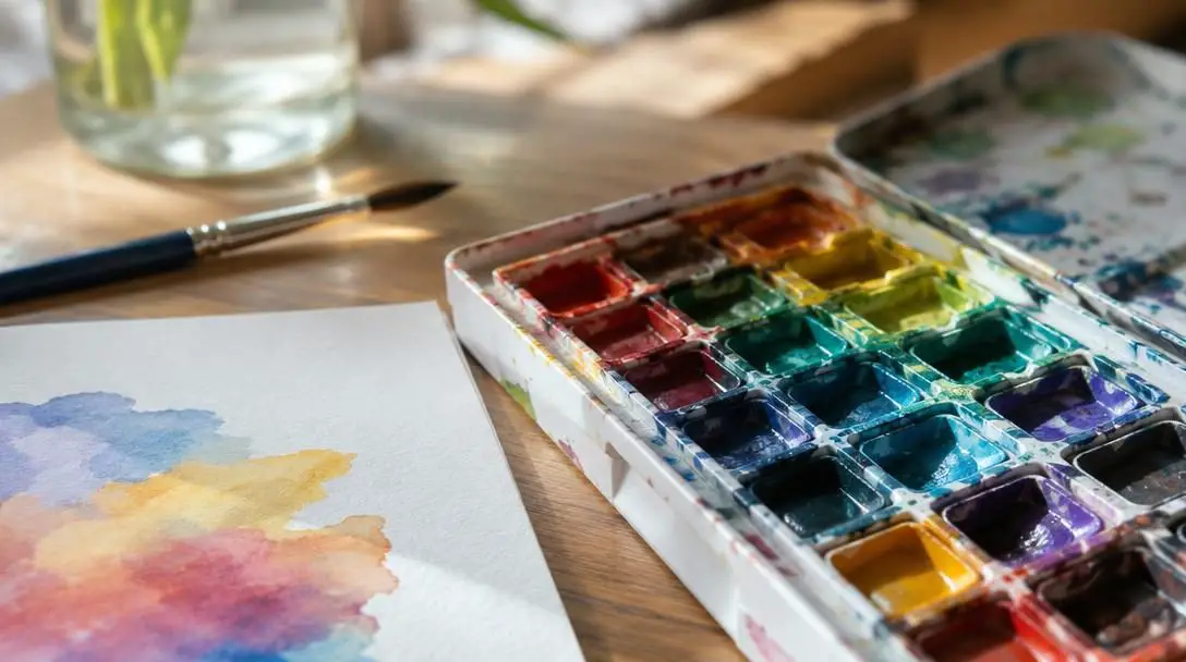
How primary and secondary hues shape human psychology
Extensive psychological and clinical observation shows that specific wavelengths trigger consistent physiological and emotional reactions. Different parts of the visual spectrum stimulate distinct states of autonomic arousal, mental concentration, and perceived comfort.
| Color | Primary Emotional Associations | Physiological Effects | Common Practical Settings |
|---|---|---|---|
| Red | Passion, excitement, urgency, danger | Elevates heart rate, raises blood pressure, stimulates appetite | Dining spaces, athletic branding, promotional sales |
| Blue | Serenity, stability, reliability, peace | Lowers heart rate, reduces blood pressure, eases respiration | Bedrooms, medical clinics, corporate institutions |
| Green | Balance, organic vitality, growth, renewal | Relaxes visual muscles, reduces cortisol, aids concentration | Workspaces, study areas, environmental wellness spaces |
| Yellow & Orange | Optimism, social warmth, cheerfulness, energy | Increases neurological alertness, encourages physical movement | Living rooms, creative studios, casual eateries |
Red
Positioned at the longest wavelength of visible light, red produces an immediate surge in biological arousal. Exposure to vivid red stimulates the sympathetic nervous system, causing measurable upticks in heart rate and breathing while sharpening sensory focus. Because red is universally tied to evolutionary markers of vital blood, ripening food, and physical hazard, it commands attention faster than any other hue. This energetic stimulus sparks feelings of passion and determination, though prolonged exposure to intense red can tip into restlessness, aggression, or hunger.
Blue
Resting on the shorter end of the visible spectrum, blue functions as the biological counterbalance to red. Viewing tranquil shades of blue slows neurological excitation, prompting a measurable drop in blood pressure and respiratory rates. Humans naturally associate blue with expansive skies and clean water sources, environments that signal safety, abundance, and physical security. Consequently, blue fosters an atmosphere of profound serenity, emotional trust, and contemplative quiet, making it ideal for combating acute anxiety.
Green
Occupying the central band of the visible spectrum, green is the easiest wavelength for the human eye to process, requiring minimal muscular adjustment from the lens. Because green dominates fertile natural landscapes, our visual systems are hardwired to associate it with life, fresh growth, and environmental equilibrium. Exposure to natural greens relieves ocular fatigue, enhances creative problem-solving, and encourages deep mental focus while keeping stress hormones low.
The impact of cultural conditioning
While human biology provides the baseline hardware for registering light, cultural narratives provide the interpretive software. A color that evokes celebration, prosperity, and joy in one society can easily communicate mourning, austerity, or peril in another. Understanding color psychology requires analyzing the cultural framework of the viewer.
A striking example appears in the divergent meanings of white and red between Western and Eastern traditions:
- White in the West: Traditionally connected to purity, virtue, and bridal joy, serving as the standard visual theme for celebratory beginnings such as weddings and baptisms.
- White in East Asia: Widely recognized as the traditional shade of grief, spiritual departure, and funeral rites, symbolizing the transition of the soul.
- Red in China: Regarded as an auspicious emblem of abundant good fortune, financial prosperity, and matrimonial joy, featured extensively during Lunar New Year and family celebrations.
- Red in Western contexts: While certainly linked to romantic passion and festive seasons, red equally serves as an urgent signifier of hazard, financial deficit, stop signals, and aggressive confrontation.
Commercial branding and consumer psychology
The global marketplace leverages the emotional language of color to shape consumer perception, project institutional authority, and guide purchasing habits. Strategic color palettes bypass conscious scrutiny, establishing an immediate visceral impression of what a company stands for.
In the fast-food sector, industry leaders like McDonald’s and Burger King strategically pair vivid red with bright yellow. This chromatic combination is not accidental: red stimulates appetite and creates a subconscious sense of speed, while yellow evokes friendly optimism and immediate visibility from a distance. Together, they create an environment that encourages customers to order quickly, eat enthusiastically, and keep customer turnover brisk.

By contrast, high-end luxury fashion houses such as Chanel and Louis Vuitton rely on a disciplined palette of deep black, crisp white, and subtle accents of gold. Black communicates uncompromising authority, timeless dignity, and formal elegance, while gold introduces an aura of rare craftsmanship and prestige. In corporate settings, healthcare providers and technology firms gravitate toward steady hues of blue to communicate professional dependability and technical competence, while sustainable agricultural and eco-conscious businesses use green to assert environmental stewardship.
Modern applications: Wellness and interior design
Beyond commerce, the intentional application of color has become an essential pillar of contemporary architecture and holistic health therapies. In therapeutic contexts, this approach manifests as chromotherapy, or color therapy, an alternative wellness modality that utilizes colored light to rebalance mental and physical vitality.
Practitioners of chromotherapy use warm red illumination to stimulate sluggish circulation and invigorate low physical motivation, while blue wavelengths are directed at patients experiencing elevated stress, nervous irritability, or chronic insomnia. While clinical research continues to investigate the exact mechanisms of light therapy, patients consistently report that dedicated color environments provide distinct psychological benefits.
In residential and architectural design, specifying color temperatures and saturation levels allows designers to customize how occupants experience each living area:
- Living rooms and dining areas: Warm ochres, terracottas, and gentle yellows foster an open, conversational atmosphere that invites social engagement and shared warmth.
- Bedrooms and private sanctuaries: Cool slates, soft blues, and muted sage greens quiet the senses, encouraging restorative rest and mental deceleration.
- Home offices and creative studies: Balanced greens and neutral grays reduce eye strain, support sustained concentration, and prevent cognitive exhaustion during long work sessions.
Step-by-step: How to design an emotionally supportive environment
Applying color psychology within a home, workspace, or digital design project requires a structured, intentional methodology rather than impulsive aesthetic choices. Following a systematic process ensures your chosen palette aligns with your emotional goals.
- Define the primary objective: Clarify the exact emotional tone you want the room or project to support. Determine whether the primary need is restful calm, energetic social interaction, disciplined creative focus, or restorative retreat before browsing paint chips or color swatches.
- Assess the local lighting conditions: Analyze the natural daylight exposure throughout the day, alongside artificial fixtures. North-facing rooms receive cool, blue-tinted natural light that can make cool grays feel chilly, whereas south-facing sunlight adds warm golden tones that intensify saturated warm paints.
- Establish a balanced palette: Follow a grounded visual hierarchy, such as pairing a dominant neutral base (60%) with a supportive secondary tone (30%) and reserving high-arousal colors like fiery red or bright yellow for small, focused accents (10%) to prevent visual overload.
- Factor in cultural and personal context: Consider the lived experiences and cultural heritage of everyone sharing the space. Personal memories tied to specific shades can override theoretical psychology, making individual comfort the ultimate guiding metric.
- Test the environment gradually: Apply large sample swatches or introduce temporary accents—such as throw pillows, blankets, or artwork—before painting entire walls. Live alongside the sample colors for several days to observe how they influence your mood across morning, afternoon, and evening light.
Frequent mistakes in color selection
Even well-intentioned decorating and design projects can run into emotional pitfalls when foundational color dynamics are overlooked. Avoiding these common missteps will protect the psychological harmony of your space:
- Inducing biological overstimulation: Covering all four walls of a home office or bedroom in saturated red or electric yellow can overwork the nervous system, leading to unexplainable irritability, restlessness, and visual fatigue.
- Overlooking cultural distinctions: Assuming that a color holds uniform emotional meaning around the world can cause severe miscommunication, particularly in corporate branding and cross-cultural hospitality environments.
- Neglecting functional room purpose: Placing aggressive warm colors in rooms meant for sleep, or painting lively social dining spaces in sterile, icy tones, works directly against how the space is intended to be used.
- Disregarding light quality: Selecting paint swatches exclusively under harsh fluorescent showroom lighting almost guarantees surprise once the pigment interacts with the softer, warmer illumination of a residential home.
- Relying on monochromatic monotony: Using an unrelenting wash of identical neutral beige or gray without texture, contrast, or tonal shifts risks creating a sensory-deprived environment that feels emotionally flat and uninspiring.
Frequently asked questions
Can color choices directly alter physical health?
Color exposure creates documented physiological shifts, including temporary changes in heart rate, blood pressure, eye strain, and hormone balance. While not a standalone cure for medical ailments, choosing appropriate colors in healing environments can measurably reduce anxiety and support overall physical comfort.
Why do fast-food restaurants rely so heavily on red and yellow?
Fast-food chains use red because it stimulates biological arousal and appetite, while yellow projects high visibility and friendly warmth. Combined, these colors create a lively, dynamic environment that subconsciously encourages quick decision-making, rapid dining, and steady table turnover.
Does lighting change how a color influences our emotions?
Yes. Color perception depends entirely on the wavelengths of light reflected off a surface. Warm incandescent lighting enriches reds, oranges, and yellows, making them feel cozy and welcoming, whereas cool LED or north-facing daylight emphasizes blues and greens, producing a crisper, more clinical atmosphere.
What is chromotherapy, and does it really work?
Chromotherapy is a holistic practice that uses specific colored lights to influence emotional and physiological imbalances, such as utilizing red to stimulate sluggish energy or blue to calm anxiety. While it should not replace established medical care, controlled light therapy has demonstrable psychological effects on mood, circadian rhythm, and perceived stress.
Why does the color green make it easier to concentrate?
Green sits directly in the center of the visible spectrum, meaning the human eye requires very little muscular effort to focus on it. Because human evolution associates green with peaceful natural settings, it lowers stress hormones, reduces visual strain, and promotes sustained mental clarity.
The bottom line
The link between color and human emotion is neither random nor purely aesthetic. It is a nuanced, deeply ingrained system rooted in our biological wiring, refined through centuries of cultural tradition, and validated by modern psychological science. Every hue in your immediate surroundings sends subtle signals to your nervous system, gently steering your focus, energy reserves, and emotional resilience.
By learning how light wavelengths interact with the eye, respecting the cultural narratives assigned to pigments, and following disciplined design principles, anyone can transform color from an afterthought into a deliberate tool for wellness, clarity, and connection. Taking time to curate the shades within your daily life is one of the simplest, most effective ways to build an environment that sustains and restores you.