
5 Tips for Creating a Cohesive Color Palette for Your Brand

In a saturated marketplace, establishing an unmistakable brand identity is essential for businesses of every scale. A cohesive color palette does far more than decorate an asset; it actively communicates your organization's core values, clarifies your commercial message, and anchors your presence across dozens of customer touchpoints.
Every day, consumers interact with companies through mobile applications, physical retail packaging, social feeds, and printed invoices. Because the human visual system processes color almost instantaneously, the hues you choose serve as an immediate shorthand for what your business represents. Designing a disciplined, unified palette turns visual cues into a reliable engine for customer trust and long-term brand recall.
Key takeaways
- A structured brand color palette establishes an immediate visual hierarchy that reduces cognitive fatigue for consumers.
- Restricting your primary visual system to two to four colors prevents visual clutter and reinforces brand recognition.
- Evaluating foundational color harmonies—such as complementary, analogous, or monochromatic pairings—creates natural visual balance.
- Thorough testing across physical print runs and backlit digital displays prevents costly production mismatches.
- Codifying colors into digital HEX, screen RGB, and print CMYK formulas within a style guide ensures consistency across every touchpoint.
The Functional Importance of Color in Brand Identity
Color is far more than an aesthetic preference; it serves as a functional framework that directs how audiences navigate your content and interpret your message. At its core, an effective color palette assigns explicit jobs to specific shades. By designating primary tones, secondary accents, and supporting background hues, you establish an intuitive visual hierarchy that guides the human eye across a page or screen.
When an audience views a coherent layout, color helps them instantly separate headlines from body copy, calls to action from passive content, and primary services from secondary details. This functional clarity reduces cognitive load, allowing users to absorb your core message without friction. When a brand's colors are inconsistent, that hierarchy breaks down. Customers must exert extra effort to discern what is important, which can lead to fatigue, confusion, or a swift exit from your digital platforms.
Furthermore, color works on a subconscious level to set expectations about your business's character and sector. The shades you adopt form a visual language that signals your identity before a prospective customer reads a single word of copy. When your visual signals align neatly with the actual experience of your service or product, you create an intuitive sense of authenticity that helps turn casual visitors into loyal brand advocates.
A defined palette provides a stable blueprint that replaces guesswork with enduring visual structure.
5 Tips for Creating a Cohesive Color Palette
Developing an effective visual identity requires balancing conceptual meaning with visual science. Applying deliberate structural rules transforms arbitrary color choices into an enduring identity system.
1. Understand Color Psychology
Color psychology is the study of how colors influence human behavior, emotions, and perceptions. Different colors evoke different emotions and have unique meanings. Understanding the psychology of color can help you select colors that align with your brand's personality, mission, and values.
When assembling your baseline palette, consider how common shades map to consumer sentiment:
- Blue: Often associated with trust and reliability, making it a common choice for organizations that want to emphasize stability, safety, and dependability.
- Red: Associated with energy and passion, providing a vibrant, active presence that commands immediate attention and conveys excitement.
- Yellow: Frequently associated with optimism and creativity, bringing a bright, cheerful, and inventive mood to your brand identity.
- Green: Represents growth and harmony, evoking a feeling of balance, nature, freshness, and steady progress.
By assessing how these underlying emotional associations correspond to your organization's mission, you can pick a direction that feels genuine rather than arbitrary. The goal is to ensure that the primary feelings evoked by your colors directly support the core message you want to deliver to the marketplace.
2. Limit Your Color Choices
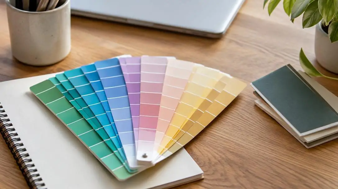
It is tempting to use many colors in your branding to make it stand out, but too many colors can be overwhelming and confusing for your customers. Instead, limit your color choices to two to four main colors. Choose a primary color that represents your brand's identity and values, then add a few complementary colors to support and enhance it. This approach creates a consistent and cohesive look and feel for your brand.
Limiting your choices forces you to be disciplined about visual hierarchy. When you confine your identity to a concise selection of two to four colors, each shade has room to breathe and perform a distinct function. A disciplined selection ensures that your audience can easily identify your signature colors across different platforms without being distracted by unnecessary visual clutter.
3. Consider Color Harmony
When selecting colors for your brand, it is essential to consider color harmony. Harmony refers to how well colors work together and how they create a balanced and unified visual experience. Selecting individual colors that look appealing in isolation does not guarantee they will look balanced when placed side by side. Exploring the relationships on the traditional color wheel helps you establish a relationship between your choices that feels natural to the human eye.
Brands typically rely on three time-tested harmony models:
- Complementary Colors: These are colors opposite each other on the color wheel. Using complementary pairings creates strong contrast and energy, helping specific elements leap forward when balanced thoughtfully.
- Analogous Colors: These are colors adjacent to each other on the color wheel. Because they share underlying color characteristics, analogous schemes naturally produce a serene, comfortable, and unified visual rhythm.
- Monochromatic Colors: These consist of variations of a single color, incorporating different tints, shades, and tones. A monochromatic scheme offers an exceptionally unified and elegant appearance, relying on depth and value shifts rather than contrasting hues.
4. Use Color in Different Ways
Using color in different ways can add depth and interest to your branding. Experiment with using your colors in different combinations, such as using your primary color for your logo and a complementary color for your website or marketing materials. You can also use color to differentiate different sections of your website or to highlight important information.
A well-planned palette should be flexible enough to solve diverse design challenges. By testing your colors in varying ratios, you discover how to make important interactive buttons pop, how to structure editorial layouts with subtle background tints, and how to create distinct category groupings in catalogs or brochures. Using your palette dynamically prevents your marketing materials from feeling static or repetitive while still preserving a recognizable identity.
5. Test Your Color Palette
Before finalizing your color palette, test it across different mediums, such as print and digital platforms, to ensure that it looks consistent and visually appealing. Colors rarely appear identical from one surface to another; a hue that looks rich and luminous on a backlit computer monitor may appear flat, dark, or muddy when pressed onto paper or cardboard.
Consider how your colors will look in various lighting conditions and how they will translate to different materials, such as packaging or merchandise. Physical goods interact with daylight, indoor fluorescent tubes, and warm home lamps in diverse ways. Evaluating your choices across actual mockups and practical prototypes prevents costly surprises down the road and guarantees that your branding holds its integrity wherever it appears.

Comparing Color Harmony Models
Understanding how color wheel positions influence visual dynamics allows you to select the right harmony framework for your brand's communicative needs.
| Harmony Model | Color Wheel Relationship | Visual Impact | Primary Brand Use Case |
|---|---|---|---|
| Complementary | Opposite positions | High contrast, vibrant energy, striking division | Action-oriented interfaces, bold callouts, dynamic sports brands |
| Analogous | Adjacent positions | Serene, comfortable, cohesive, low friction | Editorial publications, wellness offerings, corporate services |
| Monochromatic | Single hue across tints, tones, and shades | Understated, sophisticated, subtle, unified | Luxury packaging, minimalist tech hardware, architectural identity |
Step-by-Step Guide to Assembling Your Palette
Building a brand palette from scratch can feel daunting if you try to make every choice simultaneously. Breaking the process down into deliberate, sequential steps makes the task manageable and ensures every shade serves a clear purpose.
- Define Brand Attributes: Before browsing swatches, write down the fundamental values and personality traits of your business. Identify whether your brand voice is grounded, energetic, creative, or steady.
- Select Your Primary Color: Based on your core brand attributes and the principles of color psychology, pick a single primary color that serves as the visual anchor of your identity.
- Determine the Harmony Method: Decide whether your visual language will benefit most from a high-contrast complementary scheme, a unified analogous grouping, or a refined monochromatic system.
- Select Supporting Accents: Choose one to three secondary colors that support your primary shade without overwhelming it. Ensure these additions align with your chosen harmony structure.
- Assign Roles to Each Hue: Clearly map out how each color will be deployed. Designate which shade handles main headlines, which shade is reserved for buttons or calls to action, and which tones provide neutral backgrounds.
- Document the Exact Color Codes: Secure the exact digital and print values for your selected palette so that every designer, printer, and collaborator reproduces the exact same shades every time.
Common Mistakes to Avoid in Palette Design
Even with good intentions, businesses often stumble into common traps when establishing their visual systems. Being aware of these pitfalls helps you safeguard your brand from confusing aesthetic missteps.
- Overcomplicating the System: Introducing too many bright, competing colors dilutes visual identity and leaves the audience unsure of where to focus. Sticking to two to four primary and supporting colors prevents visual chaos.
- Ignoring High-Contrast Needs: Placing light colors over pale backgrounds or dark text over deep shades impairs readability. Your palette must include sufficient contrast so that text and icons can be easily read by everyone.
- Neglecting Technical Media Differences: Assuming a digital RGB color will translate perfectly onto physical CMYK print runs without adjustment leads to mismatched packaging, dull business cards, and inconsistent merchandise.
- Chasing Fleeting Trends: Building your core identity around colors that happen to be trendy in a given season risks making your brand look dated within a year or two. Aim for colors that reflect your enduring values.
- Failing to Establish Rules: Selecting colors without defining their functional roles results in inconsistent application across different team members and marketing channels.
Applying and Governing Your Colors Consistently
Once you have curated and tested your cohesive color palette, the next crucial step is governance. A color palette only builds recognition if it is applied systematically across every public and internal asset your business produces.
To ensure long-term consistency, compile your selected shades into an accessible brand style guide. This document should explicitly state the exact color codes for every environment, including:
- HEX Codes: Six-digit hexadecimal values engineered specifically for digital screens, websites, and user interfaces.
- RGB Formats: Red, green, and blue light balances for screen-based presentations, broadcast media, and video assets.
- CMYK Formats: Cyan, magenta, yellow, and key (black) ink ratios required for commercial four-color process printing.
- Spot Inks: Standardized premixed ink systems, such as Pantone formulas, for precise packaging, signage, and merchandise color matching.
Include clear examples demonstrating correct and incorrect pairings, proper contrast ratios for body text, and guidelines on how to handle photography alongside your color blocks. Finally, conduct an audit of existing assets to bring them into alignment. Update your website, business cards, email newsletters, social media templates, product packaging, and office stationery so they present a unified front. By diligently upholding your palette across every channel, you transform simple visual colors into an unmistakable asset that strengthens customer trust and sets your business apart in a crowded marketplace.
Frequently asked questions
How many colors should a brand color palette have?
A brand color palette should generally be limited to two to four main colors. This includes one primary anchor color and one to three supporting or complementary colors, which keeps marketing assets organized, distinct, and uncluttered.
Why do colors appear differently in print compared to digital screens?
Digital screens emit light using an additive RGB (red, green, blue) color model, which produces vivid, glowing tones. Print materials rely on a subtractive CMYK (cyan, magenta, yellow, black) ink model that absorbs light reflected off paper, often resulting in slightly darker or less saturated appearances.
What is the difference between complementary and analogous colors?
Complementary colors sit opposite each other on the color wheel and provide intense visual contrast that is ideal for calls to action. Analogous colors sit next to each other on the wheel, sharing visual undertones that produce a smooth, harmonious, and unified aesthetic.
How does color psychology impact brand perception?
Color psychology links specific hues to subconscious emotional states. For example, blue evokes reliability and trust, red suggests energy and passion, yellow indicates optimism, and green signals balance and growth. Aligning your palette with these associations helps communicate your brand's mission before a customer reads any text.
What documentation is required to keep a color palette consistent?
A centralized brand style guide must record the exact HEX codes for web design, RGB values for digital presentations, and CMYK or spot formulas for physical print. It should also outline rules for background contrast and functional color deployment.
The bottom line
A cohesive color palette is not an ornamental luxury; it is a foundational business tool that establishes credibility, clarifies communication, and reinforces customer loyalty. By grounding your color selections in sound psychology, limiting your total choices, selecting a balanced harmony model, and rigorously testing across mediums, you construct a resilient visual identity. Backed by clear style guidelines and consistent cross-channel application, a thoughtful palette ensures your brand remains instantly recognizable and memorable wherever your audience encounters it.