5 Worst Kits in English Premier League History
Designing an iconic match uniform for an elite football club is one of the most demanding tasks in modern athletic apparel. Manufacturers must balance heritage, brand identity, performance textiles, and commercial appeal, knowing that their work will be scrutinized by millions of supporters every week. When sports brands get the styling right, a jersey can become an enduring cultural classic; when they miss the mark, the result is immortalized among the most memorable fashion disasters in sports history.
Every single entry on the list of the worst kits in English Premier League history traces back to a single chaotic decade: the 1990s. Following the launch of the Premier League in 1992, sportswear companies embraced daring patterns, experimental color palettes, and revolutionary printing techniques. While some experiments produced legendary collector pieces, others generated visual trainwrecks on the pitch. Here is a definitive look at the five most catastrophic kit designs from the competition's early years, along with the design lessons modern apparel makers can take from them.
Key takeaways
- All five of the worst kit designs in Premier League history originated during the fashion-forward and experimental decade of the 1990s.
- New dye-sublimation technology allowed manufacturers to print complex, multi-colored polyester patterns that often translated into blurry eyesores on period television screens.
- Poor visual contrast, clashing commercial sponsor logos, and disjointed asymmetrical graphics were the primary design culprits behind these infamous shirts.
- While an unsightly uniform did not stop Manchester United from winning the 1995-96 league title, teams like Middlesbrough and Nottingham Forest suffered relegation while wearing their fashion disasters.
The 1990s aesthetic explosion in English football
To understand how professional clubs took the field in such visually abrasive gear, one must look at the seismic commercial shift that shook English football in the early 1990s. The founding of the Premier League in 1992 unlocked unprecedented domestic and international television broadcast agreements. Football kits were no longer treated merely as utilitarian athletic gear worn exclusively on match days; they were transformed into high-margin consumer merchandise sold directly to rapidly expanding global fanbases.
At the exact moment commercial demand surged, textile manufacturing underwent a technological revolution. Dye-sublimation printing replaced traditional screen printing and sewn-on fabric panels, granting designers the freedom to infuse complex gradients, photographic textures, and abstract geometric shapes directly into lightweight synthetic polyester. Eager to display their newfound manufacturing prowess, apparel manufacturers abandoned decades of traditional minimalism in favor of maximalist visual chaos designed to demand immediate attention on retail shelves.
At a glance: The Premier League's most infamous kits
The following overview breaks down the key details, aesthetic flaws, and competitive outcomes associated with the five most heavily criticized uniforms in league history.
| Club | Season | Kit Type | Primary Aesthetic Issue | League Finish |
|---|---|---|---|---|
| Coventry City | 1992-93 | Home and Away | Chaotic, heritage-free abstract graphics across fabric | 15th place (38 pts) |
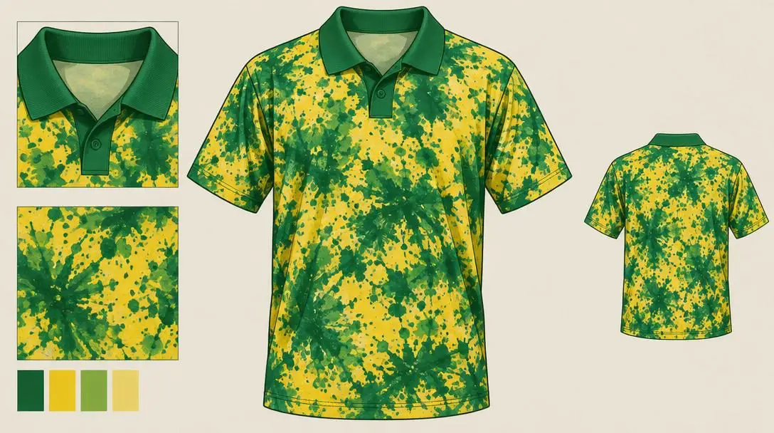
| Norwich City | 1993-94 | Home | Mottled yellow-and-green print resembling botched tie-dye | 12th place (53 pts) |
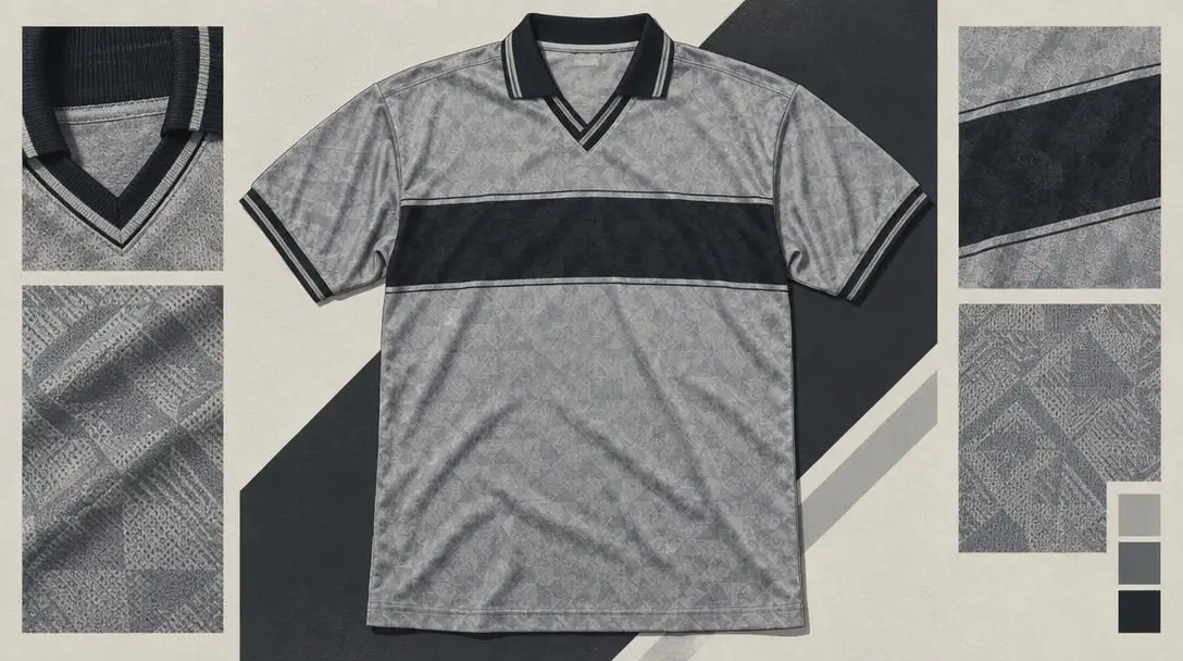
| Manchester United | 1995-96 | Alternate | Faded grey palette with cluttered, heavy-bordered typography | Champions (84 pts) |
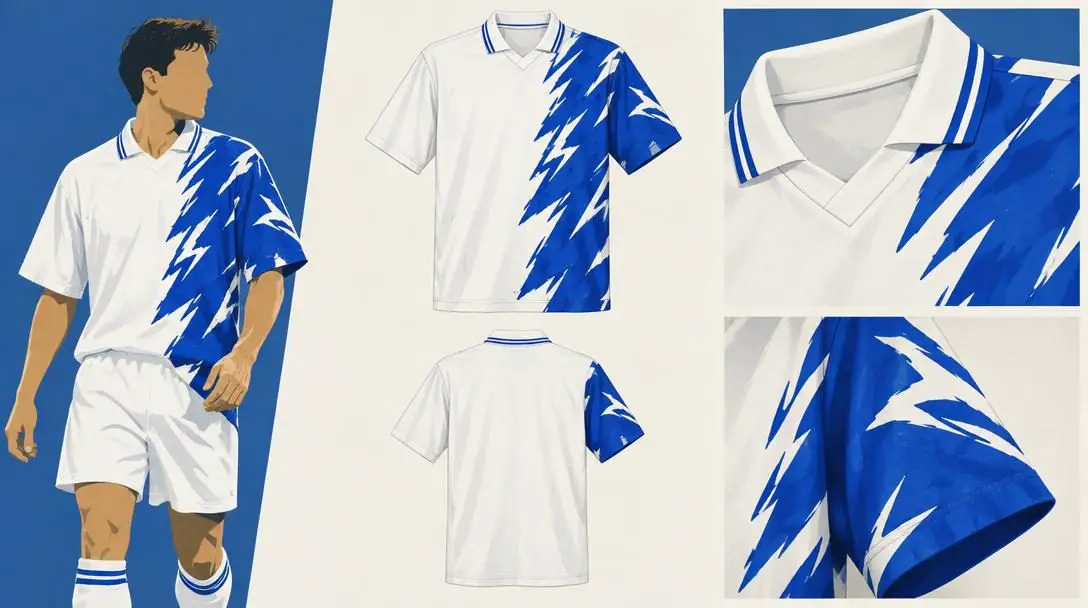
| Middlesbrough | 1996-97 | Away | Asymmetrical, off-center blue pattern spilling onto the sleeve | 19th place (39 pts) |
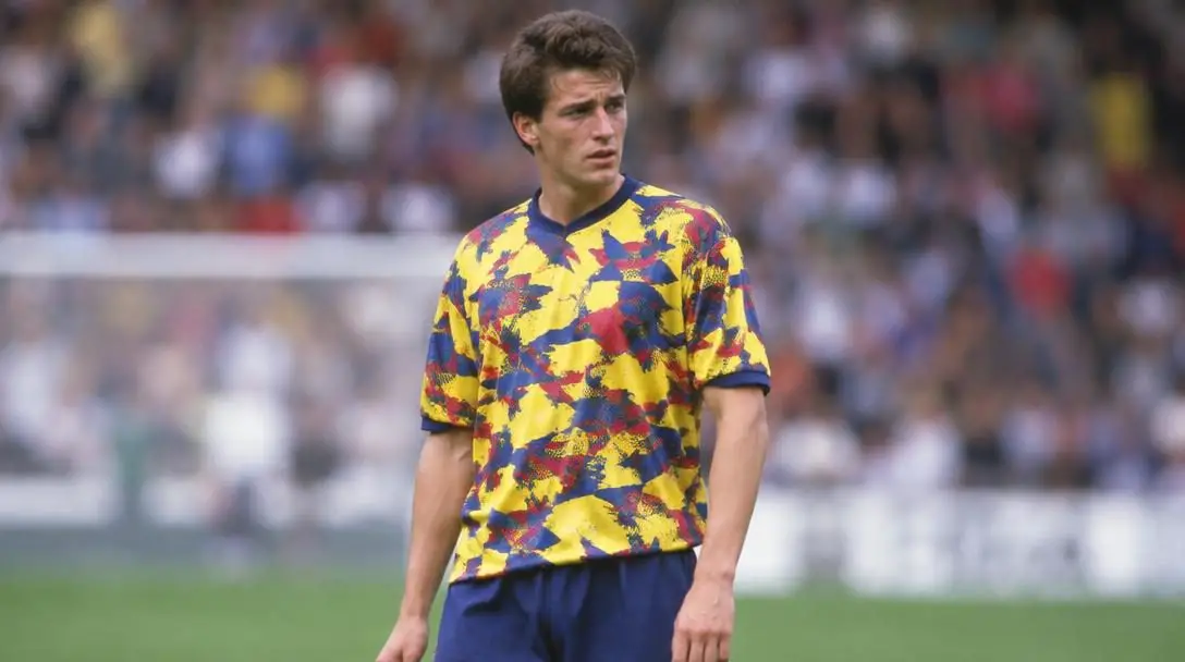
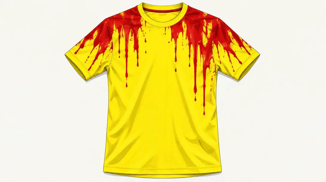
| Nottingham Forest | 1996-97 | Alternate | Dripping red paint-effect typography down yellow fabric | 20th place (34 pts) |
The five worst kits in Premier League history
While experimental design helped define the early Premier League era, these five kits pushed creative boundaries past the breaking point, earning lasting reputations as the competition's ultimate fashion misfires.
Coventry City (1992-93)
- Season: 1992-93
- Kit Type: Home and away jerseys
- Final League Standing: 15th (38 points)
- Relegation Status: Survived via goal differential
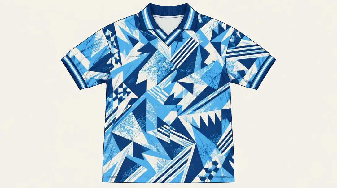
The Premier League's inaugural 1992-93 campaign brought widespread excitement, but Coventry City's kit launch delivered immediate aesthetic dread. Rather than relying on simple sky blue traditions, the club approved home and away shirts covered in intricate, disorienting patterns that bore zero connection to Coventry's municipal heritage or footballing history. The busy graphic was applied indiscriminately across both the blue primary strip and the red alternate version.
The shirts were widely panned by neutral observers and supporters as genuine eyesores. On contemporary television sets, the dense graphics merged into an illegible, muddy visual presentation that made following the action difficult from standard broadcast angles. The club's on-pitch fortunes were nearly as bleak as their wardrobe: Coventry scraped together just 38 points, finishing level with two other struggling clubs and only escaping relegation down to the second tier by virtue of a superior goal differential.
Norwich City (1993-94)
- Season: 1993-94
- Kit Type: Home jersey
- Final League Standing: 12th (53 points)
- Shirt Sponsor: Norwich and Peterborough Building Society
Norwich City boasts one of the most recognizable color schemes in world football, sporting a vibrant blend of yellow and green. However, the club's 1993-94 home kit demonstrated how quickly that festive palette could turn sour when paired with reckless graphic design. The jersey featured a scattered, mottled texture across the chest and torso that resembled an accidental tie-dye experiment or an ink splatter accident, clashing violently with a clean, solid-colored traditional collar.
The optical confusion was worsened by the prominent chest sponsorship for the Norwich and Peterborough Building Society. Rather than integrating naturally into the fabric design, the rectangular commercial graphic looked tacked on as an afterthought, sitting dead-center atop the dizzying background print. Fortunately for the Canaries, their play on the pitch provided welcome relief from their apparel. Norwich performed as one of the highest-scoring teams in the competition, compiling 53 points to secure a comfortable 12th-place finish well clear of the drop zone.
Manchester United (1995-96)
- Season: 1995-96
- Kit Type: Alternate (third) jersey
- Final League Standing: Champions (84 points)
- Shirt Sponsor: Sharp Viewcam
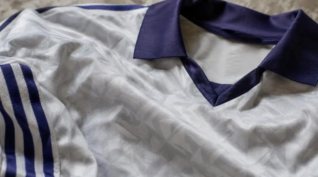
Manchester United enjoyed widespread praise for their traditional home jersey during the 1995-96 season, with many historians ranking that crisp red shirt among the finest in English football history. In sharp contrast, United's alternate grey strip produced intense backlash from the moment it debuted. Styled in a dull, faded grey hue, the torso was cut in half by a dark horizontal chest band housing an advertisement for the Sharp Viewcam, producing a disjointed and washed-out silhouette.
The reverse side of the kit suffered from poor legibility, featuring oversized squad numbers and player names enclosed in thick, heavy borders that cluttered the aesthetic. Despite becoming one of the most ridiculed kits of the decade, the jersey's rare appearances did not derail United's pursuit of silverware. Alex Ferguson's squad claimed the 1995-96 Premier League title with an emphatic 84 points, finishing 10 points clear of their closest challengers and earning direct qualification to the UEFA Champions League.
Middlesbrough (1996-97)
- Season: 1996-97
- Kit Type: Away (road) jersey
- Final League Standing: 19th (39 points)
- Shirt Sponsor: Cellnet
Middlesbrough entered the 1996-97 campaign with strange graphic themes across their entire uniform catalog. Their red home strip raised eyebrows with an unusual, busy background pattern that competed heavily with the white Cellnet commercial logo. Yet it was the club's white away strip that cemented its place in uniform infamy. The jersey was dominated by an off-center, bright blue abstract pattern that occupied one side of the chest before inexplicably spreading outward onto the adjoining sleeve.
The disjointed, unbalanced composition forced viewers to squint during live play, giving the jersey the appearance of an unfinished assembly error rather than a high-end professional uniform. Middlesbrough's turbulent campaign ended in tragedy on the pitch as well. Despite accumulating 10 wins and 16 draws for a total of 39 points, the club suffered relegation from the Premier League alongside Nottingham Forest, finishing second from the bottom of the table.
Nottingham Forest (1996-97)
- Season: 1996-97
- Kit Type: Alternate jersey
- Final League Standing: 20th (34 points)
- Relegation Margin: 5 points adrift of 19th place
Nottingham Forest wore a clean, dignified primary red uniform throughout 1996-97, but their yellow alternate kit stood out for all the wrong reasons. The shirt attempted an edgy graphic flourish: red lettering placed high near the shoulders featured irregular dripping tails that extended downward across the torso. Instead of looking bold and modern, the visual gave viewers the impression that the kit manufacturer had experienced a catastrophic ink bleed on the assembly line.
A classic yellow jersey paired with crisp, clean red typography would have produced a striking, stylish combination, but the faux-melting text doomed the kit to ridicule. The fashion blunder mirrored an agonizing season on the pitch. Forest endured a miserable campaign, finishing dead last in 20th place with a meager 34 points—five points behind 19th-place Middlesbrough. Though Forest rebounded immediately by winning the Football League First Division the following year, their top-flight return was brief, culminating in another last-place Premier League finish in 1998-99.
A clean yellow jersey paired with crisp red lettering would have made for an attractive strip, but the strange dripping visual effect turned it into a league-wide disaster.
The football kit lifecycle: From design concept to match day
Producing an official match jersey involves a disciplined development schedule that begins over a year before players step onto the pitch. Apparel suppliers and club executives collaborate through a structured multi-stage workflow to balance commercial appeal, technical requirements, and club tradition:
- Concept development: Apparel designers establish central creative narratives, drawing inspiration from club archives, architectural landmarks, fan culture, and global streetwear trends.
- Color palette and graphic selection: Design teams map out base fabric shades, secondary accent colors, and geometric overlays, ensuring all elements harmonize without visual clutter.
- Sponsor and crest integration: Club crests, sportswear brand logos, and corporate sponsor emblems are positioned according to strict league dimensions and contrast standards.
- Material prototyping: Technical textile mills weave sweat-wicking synthetic polyesters engineered for breathability, lightweight movement, and consistent dye absorption.
- Broadcast testing and club approval: Club executives and kit managers evaluate sample uniforms under stadium floodlights and wide-angle broadcast cameras to confirm readability.
- Mass manufacturing and retail launch: Once certified, partner factories produce millions of units for international retail supply chains and the first-team locker room.
How to design an effective football uniform
Creating a football kit that earns the respect of supporters while standing up to high-intensity athletic use requires a structured, intentional approach. Apparel designers can avoid the high-profile pitfalls of the 1990s by following this six-step production sequence:
- Define the primary club identity: Establish the club's non-negotiable heritage colors as the dominant base tone before introducing secondary trims or experimental shades.
- Establish a distinct focal point: Determine whether the club crest, collar construction, or chest sponsor should command visual priority, keeping adjacent surfaces clean to prevent visual competition.
- Enforce strict contrast standards: Ensure player squad numbers, player names, and primary chest branding stand out cleanly against the base fabric for match officials and spectators.
- Audit designs across media platforms: Test mockups across broadcast camera feeds, digital mobile screens, and printed media to confirm that intricate patterns do not degrade into blurry noise.
- Integrate novelty subtly: Channel innovative textures through jacquard weaves, micro-perforations, or sleeve-cuff accents rather than plastering chaotic prints across the entire jersey torso.
- Collect operational feedback: Review early physical prototypes with team equipment managers, first-team players, and supporter groups to evaluate comfort, fit, and visual appeal.
Critical design mistakes sports apparel brands must avoid
The misadventures of 1990s kit manufacturers offer clear guidance on what modern sports uniform designers should never do. Avoiding these recurring design traps protects brand credibility and club prestige:
- Over-complicating graphic patterns: Flooding the jersey fabric with chaotic textures or multi-directional geometry distracts from the club badge and dilutes team identity.
- Ignoring corporate sponsor synergy: Forcing a hard-edged, multi-colored sponsor box onto a patterned jersey background breaks visual cohesion and appears tacked on.
- Sacrificing broadcast legibility: Choosing mid-tone color schemes or heavy font borders makes it difficult for match commentators, referees, and television viewers to read player details.
- Imbalanced asymmetrical layouts: Placing dense graphic prints off-center or allowing textures to spill haphazardly across individual sleeves often looks like a production defect.
- Clashing structural collars and cuffs: Pairing an experimental, abstract-patterned body with a formal, stark solid-colored collar produces an incoherent, dated silhouette.
Frequently asked questions
Why did so many bad football kits appear during the 1990s?
The 1990s brought the introduction of digital dye-sublimation textile printing, which allowed manufacturers to print complex, multi-colored graphics directly into polyester fabric. Coupled with the commercial launch of the Premier League and booming replica shirt sales, sportswear brands took aggressive, unregulated design risks that frequently backfired.
Did Manchester United's grey kit affect their match results?
While the grey shirt was widely criticized by viewers and players for being difficult to spot across the field in poor light, it did not ruin the club's domestic season. Manchester United captured the 1995-96 Premier League title with 84 points, finishing 10 points clear at the top of the table.
Why was Coventry City's 1992-93 kit criticized on television?
The complex, abstract graphics featured on Coventry City's 1992-93 home and away jerseys lacked clean contrast. When broadcast on early 1990s CRT television sets, the dense geometric patterns blurred together into a muddy, indistinct smear on the screen.
What was wrong with Nottingham Forest's 1996-97 alternate kit?
The yellow jersey featured red lettering positioned near the shoulders that dripped down the torso in an uneven fashion. The melting effect made the shirt look like a botched factory printing error rather than an intentional athletic uniform design.
Are these 1990s fashion fails valuable to jersey collectors today?
Yes. Due to nostalgic retro trends and the distinctive quirkiness of early Premier League merchandise, many of the most heavily panned 1990s kits have gained cult status, becoming sought-after collector items on the vintage sportswear market.
The bottom line
The early years of the English Premier League will always be remembered for daring visual experimentation, but the kits worn by Coventry City, Norwich City, Manchester United, Middlesbrough, and Nottingham Forest illustrate what happens when apparel makers prioritize novelty over fundamentals. As modern sportswear suppliers balance heritage with high-tech performance fabrics, the cautionary tales of the 1990s remain an indispensable masterclass in why clean composition, sharp contrast, and respect for club identity will always outshine chaotic design gimmicks.