5 Most Unique Jerseys in Hockey History

Unlike many professional sports leagues where uniform templates remain tightly constrained, the National Hockey League provides franchises with an unusually expansive creative canvas. Because hockey sweaters must fit over extensive body armor, elbow pads, and chest protectors, the sheer physical surface area grants designers room for bold striping patterns, elaborate crest embroidery, and detailed thematic illustrations. While historic clubs like the Toronto Maple Leafs and Detroit Red Wings maintain virtually untouched, traditional visual identities, newer franchises have frequently embraced radical visual experiments to captivate audiences and establish their presence.
Over the decades, these creative gambles have produced some of the most memorable and polarizing garments in professional sports history. While some unorthodox designs crashed spectacularly upon arrival and were retired after a handful of appearances, others achieved celebrated cult status or sparked entire retro revivals years after leaving the ice. Below is an in-depth examination of five of the most unique uniforms ever worn in hockey history, detailing how they were conceived, received, and remembered.
Key takeaways
- Heavy protective padding makes hockey sweaters larger than typical athletic shirts, giving design teams an expansive canvas for unconventional graphics.
- Newer NHL franchises often experiment with bold aesthetics, while long-standing traditional teams remain bound to classic, unvarying uniform templates.
- Visual risks that initially faced intense fan backlash, such as cartoon mascots and intricate stormy scenes, frequently become prized collector grails over time.
- Technical uniform manufacturing has expanded from standard embroidery to specialized elements like glow-in-the-dark numbering and layered tackle twill.
At a glance: Five distinctive hockey uniforms
| Franchise | Era Introduced | Primary Visual Theme | Key Defining Detail | Modern Status |
|---|---|---|---|---|
| Vegas Golden Knights | Reverse Retro Era | Vintage Las Vegas resort signs | Glow-in-the-dark embroidered numbers | Modern promotional creation |
| Tampa Bay Lightning | Late 1990s | Oceanic electrical storm | Lightning bolts and rain graphics on sleeves | Revived during Reverse Retro program |
| Dallas Stars | Mid-2000s | Taurus constellation | Bovine-shaped celestial chest crest | Retired after the 2005-06 campaign |
| Los Angeles Kings | 1995-96 Season | Regal monarch portraiture | Off-center bearded king head crest | Discarded after a single season |
| Mighty Ducks of Anaheim | 1995-96 Season | Full-body mascot illustration | Wild Wing breaking through a frozen pond | Brought back for Reverse Retro games |
Five of the most unconventional uniforms in hockey history
Vegas Golden Knights Reverse Retro Uniform
- Design Inspiration: Vintage Las Vegas casino marquees
- Standout Feature: Glow-in-the-dark stitched jersey numbers
- Introductory Era: NHL Reverse Retro Program
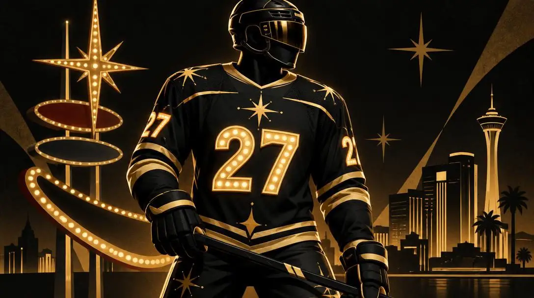
When the National Hockey League introduced the league-wide Reverse Retro campaign, established franchises dug deep into their extensive historical archives to re-color past sweaters. Newer organizations faced a distinct creative hurdle: having taken the ice only recently, the Vegas Golden Knights had no vintage uniform catalog to revisit. Instead of treating their brief history as a handicap, the design team engineered an entirely original concept built from the ground up to honor the early mid-century resort era of their home city.
The sweater drew inspiration from classic Las Vegas architecture, incorporating typography derived directly from legendary casino marquees like the Stardust and Excalibur. What elevated the uniform into unprecedented territory was its functional theatricality. The sweater numbers featured specialized stitching engineered to glow in the dark. During the dramatic pregame spectacles staged at T-Mobile Arena, the venue lights extinguished completely, leaving the roster to emerge onto the ice illuminated only by their radiant uniform numbers while "John Wick Mode" resonated through the arena sound system.
Tampa Bay Lightning Storm Alternate Uniform
- Era Introduced: Late 1990s
- Primary Imagery: Lightning strikes and choppy ocean water
- Subsequent Direction: Replaced by minimalist styling in the late 2000s
During the latter portion of the 2000s, the Tampa Bay Lightning shifted toward a stripped-down, traditional uniform framework that won widespread praise from professional graphic designers for its crisp lines and restrained minimalism. That tidy aesthetic, however, stood in stark contrast to the unrestrained visual chaos the club unveiled during the alternate jersey craze of the late 1990s.
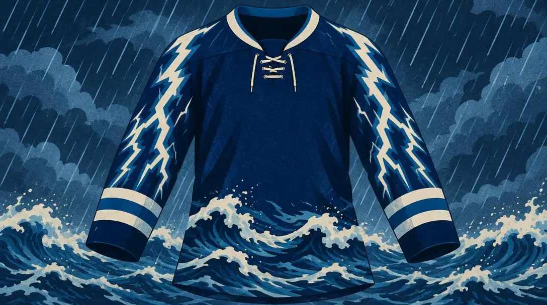
The alternate sweater took the foundational layout of the team's standard home uniform and amplified the weather theme to an extreme degree. Rather than relying solely on a clean chest crest, the uniform showcased jagged lightning bolts cascading directly down the sleeves while rain pelted across a dark, turbulent sea along the bottom hem. At the time of its debut, sports critics and traditionalists dismissed the look as excessively busy and visually overwhelming. The franchise retired the design before entering the 21st century, though changing aesthetic tastes eventually prompted the organization to resurrect the iconic stormy concept as part of its contemporary Reverse Retro lineup.
Dallas Stars Taurus Constellation Alternate Uniform
- Era Active: Mid-2000s through 2005-06 season
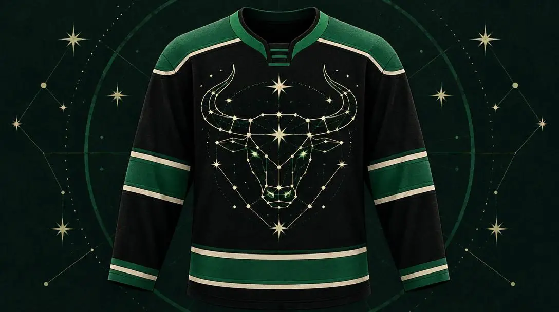
- Intended Motif: Celestial Taurus star formation
- Fan Nickname: The "Mooterus"
During the late 1990s and the dawn of the 2000s, the Dallas Stars sat atop the hockey world, establishing an elite franchise identity bolstered by bold, star-shaped sweater striping that framed the torso. When the organization introduced a black alternate sweater during the mid-2000s, it chose to abandon those triumphant geometric patterns entirely, pivoting toward an abstract interpretation of the team moniker.
Instead of featuring traditional star striping, the sweater presented a lone constellation across the chest intended to represent Taurus, the celestial bull. The visual execution, however, missed its target with fans and media alike. Observers noted that the interconnected red and white constellation lines bore a glaring resemblance to female reproductive anatomy or a stylized cow head rather than a majestic star cluster. Hockey fans swiftly christened the garment the "Mooterus". The uniform was widely panned across the league, and after the conclusion of the 2005-06 campaign, the Stars discarded the look and proceeded for years without fielding any alternate uniform at all.
A design conceived to celebrate a celestial constellation quickly became one of the most lampooned sweaters in professional hockey history.
Los Angeles Kings 1995-96 Alternate Uniform
- Era Active: 1995-96 season only
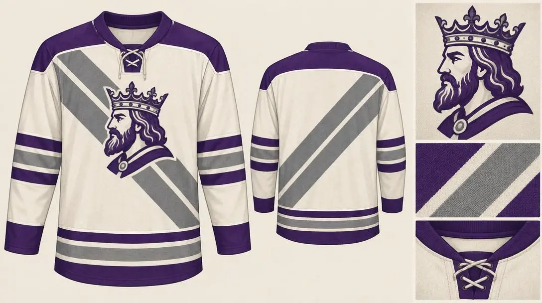
- Defining Feature: Off-center crowned monarch portrait
- Fan Nickname: The "Burger King" jersey
The 1995-96 NHL season served as ground zero for experimental third jerseys, and the Los Angeles Kings produced one of the most eccentric entries of that pioneering class. Despite having the game's greatest icon, Wayne Gretzky, leading their roster on the ice, the Kings stepped away from their clean, silver-and-black aesthetic to embrace a jarring visual experiment.
The alternate sweater featured two asymmetrical, oddly angled grey stripes slashing diagonally across the torso. The centerpiece was an off-center crest depicting a bearded monarch in profile, wearing an elaborate crown—a visual element completely foreign to the team's prior visual history. The caricature bore an unmistakable resemblance to the fast-food mascot of Burger King, prompting spectators to assign that disparaging moniker to the uniform almost immediately. The Kings wore the polarizing design only a handful of times before burying it deep in the team vault after the season finished, turning original game-worn versions into rare relics of 1990s excess.
Mighty Ducks of Anaheim Wild Wing Alternate Uniform
- Era Introduced: 1995-96 season
- Corporate Influence: The Walt Disney Company
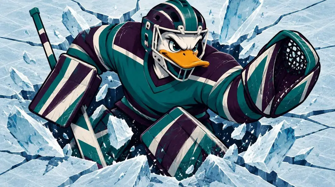
- Key Imagery: Wild Wing mascot bursting through a frozen pond
Southern California hockey design reached peak experimental theater in 1995-96 when the Mighty Ducks of Anaheim debuted their own alternate sweater alongside the Kings. Heavily steered by their founding parent entity, The Walt Disney Company, the Ducks chose to abandon standard logo restraint by placing their full-bodied anthropomorphic duck mascot, Wild Wing, directly onto the center of the uniform.
Rather than using only the iconic duck-shaped goalie mask logo, the garment showed Wild Wing violently breaking through a sheet of cracked pond ice, wielding an oversized goalie stick while wearing chest and leg protective equipment—though notably bare-footed. The enormous illustrative graphic spanned almost the entire torso, creating an intensely busy scene that looked more like an animated poster than a traditional athletic uniform. The oversized crest was deemed too cumbersome for practical hockey presentation and vanished after just one season. Decades later, however, era-defining nostalgia softened public opinion, transforming the one-year oddity into a celebrated collectible that the franchise resurrected for special modern promotional nights.
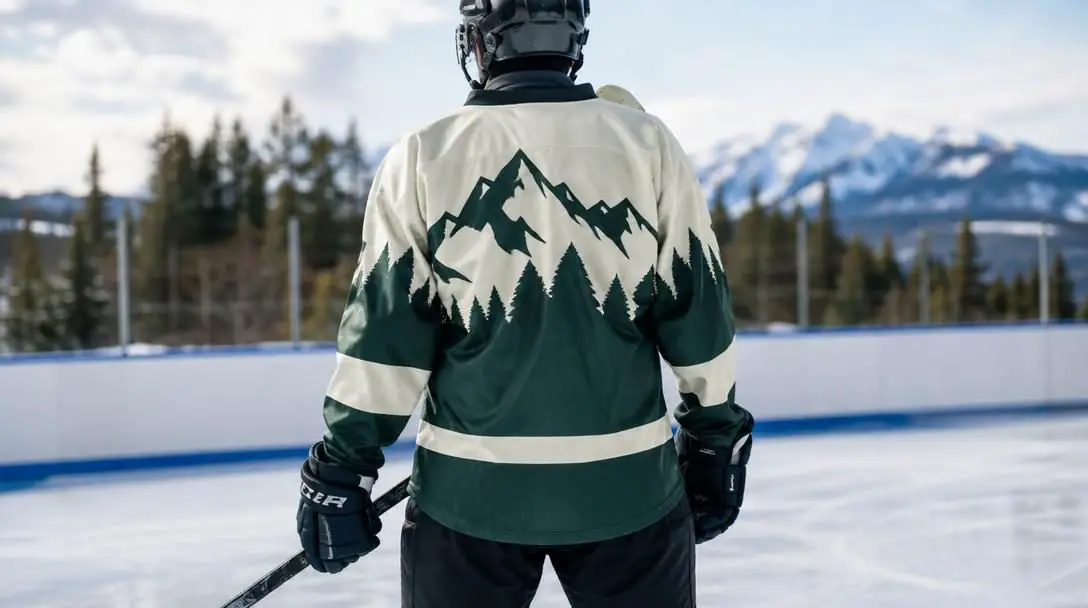
How hockey sweater construction enables bold designs
The process of transforming an abstract artistic concept into a functional National Hockey League sweater requires balancing theatrical vision against intense athletic demands. Unlike baseball jerseys or soccer kits, which prioritize lightweight, close-fitting silhouettes, hockey apparel must accommodate complex structural layers:
- The Canvas and Cut: Broad shoulders, spacious chest dimensions, and flared sleeves are engineered to fit smoothly over bulky protective padding. This oversized tailoring provides designers with substantial physical real estate, permitting full-body character portraits and wrap-around weather panoramas that simply would not fit onto garments from other sporting codes.
- Embellishment Techniques: Translating concepts onto fabric requires combining layered tackle twill, dense embroidery, screen-printed dye sublimation, and specialty threads. Complex graphics like the shattered-ice fragments of the Mighty Ducks sweater or the multi-layered borders of casino-style fonts demand precise structural stitching to prevent the uniform from puckering during rigorous on-ice competition.
- Visual Balance and Legibility: Uniform creators must integrate high-concept artwork without compromising player identification. Sleeve striping, front crest placement, back numbers, and player nameplates must maintain sharp contrast under blinding arena halogen lights and high-definition television broadcasts, which explains why designs with low-contrast detailing often struggle in active competition.
- Approval and Manufacturing Phases: Every proposed alternate sweater undergoes extensive reviews involving franchise executives, league officials, and authorized apparel partners. Prototypes undergo visual testing on the ice before entering factory production runs for active rosters and commercial retail channels.
Collector guide: Evaluating and caring for rare hockey sweaters
For memorabilia enthusiasts and passionate supporters, locating and preserving vintage or experimental hockey sweaters requires methodical verification and dedicated maintenance practices.
- Authenticate the Manufacturing Era: Examine the interior neck labels, hemline tags, and manufacturer logos to confirm whether an item is an authentic mid-1990s original or a contemporary reproduction from campaigns like the Reverse Retro series. Modern reissues generally utilize lighter polyester blends and modern branding marks.
- Inspect Crest Embroidery and Stitching: Scrutinize the primary chest crest and player numbering. Ensure that multi-layered tackle twill patches—such as the intricate constellation lines of the Dallas sweater or the layered fabric pieces of the Kings monarch crest—remain firmly attached with no fraying or thread separation.
- Evaluate Sizing and Cut: Determine whether the sweater is an authentic on-ice professional cut or a commercial retail replica. Authentic professional sweaters incorporate reinforced elbows, double-layered shoulders, and a heavy-duty fabric fight strap stitched into the lower back inside hem.
- Apply Gentle Cleaning Protocols: Launder rare sweaters inside-out using cold water on the gentlest machine cycle, avoiding fabric softeners that can break down embroidery adhesives. Never place vintage athletic garments in a heated tumble dryer; always air-dry them flat to prevent heat shrinkage and puckering.
- Store on Padded Support: Keep sweaters hung on wide, contoured, padded hangers to protect the heavy shoulder fabric from stretching. If storing garments folded inside storage containers, place sheets of acid-free tissue paper between the folds to prevent large, rubberized, or embroidered crests from creasing permanently.
Common pitfalls in uniform appraisal and evaluation
When assessing the historical significance and cultural reception of unusual sports uniforms, observers and collectors frequently fall victim to common misunderstandings:
- Assuming Notoriety Equals Universal Acclaim: It is easy to assume that jerseys remembered vividly today were adored during their initial release. In reality, garments like the Dallas constellation and the Kings alternate were subject to blistering criticism upon arrival, only achieving affection decades later as nostalgic curiosities.
- Underestimating On-Ice Visibility Issues: Elaborate design ideas that appear stunning on high-resolution graphic design software can become illegible mush from the upper bowl of an arena. The stormy seas of Tampa Bay and the complex shattered ice of Anaheim suffered because their fine details blurred together under arena spotlights.
- Mistaking Scratch-Built Concepts for Historical Throwbacks: Many enthusiasts assume that all retro promotional uniforms replicate past garments. However, organizations without decades of archival uniforms—such as the Vegas Golden Knights—often forge completely novel designs that invent a stylized alternate past rather than copying an actual historic kit.
- Neglecting Environmental Deterioration: Enthusiasts frequently fail to protect vintage synthetics from humidity, temperature swings, and direct sunlight. Sweaters from the 1990s and early 2000s rely on heat-activated adhesives that can dry out and bubble if kept in poorly ventilated attics or damp basements.
What to consider when evaluating future uniform launches
The polarizing history of these five sweaters reveals key patterns that continue to influence modern athletic branding and merchandising strategies:
- The Twenty-Year Nostalgia Cycle: Uniforms that were widely mocked upon introduction routinely undergo rehabilitation as the generation that grew up seeing them reaches adulthood. Designs once discarded after a single season are now frequently embraced as prime source material for modern throwback events.
- The Tension Between Tradition and Novelty: Original Six franchises must satisfy deeply conservative fanbases that resist even minor alterations to heritage uniforms, whereas modern expansion franchises possess the creative freedom to deploy non-traditional themes, unconventional fonts, and theatrical embellishments.
- Evolving Garment Engineering: Ongoing innovations in technical textiles, heat-pressed vinyls, and specialized phosphorescent threading continue to push the boundaries of what uniform manufacturers can execute on ice, ensuring that the next generation of alternate sweaters will feature visual elements never before seen in the sport.
- Lasting Franchise Lore: Even when an alternate uniform is scrapped after a single season, the cultural conversations, fan debates, and humorous nicknames it inspires remain permanently woven into the identity and storytelling of the organization.
Frequently asked questions
Why did the Dallas Stars alternate uniform earn the nickname "Mooterus"?
Although the mid-2000s alternate sweater was designed to depict the celestial constellation Taurus the Bull, fans immediately noticed that the constellation layout resembled a stylized cow's head combined with the shape of a uterus. The portmanteau "Mooterus" became the universal fan nickname for the polarizing uniform until it was retired in 2006.
Why were the 1995-96 Los Angeles Kings alternate jerseys called the "Burger King" sweaters?
The alternate jersey featured an off-center crest displaying a bearded king's head in profile wearing an ornate crown. The artistic rendering closely matched the visual appearance of the cartoon mascot used by the Burger King fast-food franchise, leading hockey enthusiasts and commentators to assign that nickname to the short-lived sweater.
How did the Vegas Golden Knights create a Reverse Retro jersey without a historical archive?
Because the Golden Knights had only joined the NHL in 2017 and possessed no vintage uniform archive to draw from, the franchise designed a completely original uniform inspired by early mid-century Las Vegas resort culture. The crest and numbers utilized typography inspired by classic signs from the Stardust and Excalibur casinos, enhanced with glow-in-the-dark stitching.
What caused the Mighty Ducks to abandon their full-body Wild Wing uniform after just one season?
The 1995-96 alternate uniform featured an expansive illustration of the mascot Wild Wing breaking through a frozen pond. The massive, detailed graphic proved excessively busy for standard sporting competition, making the uniform difficult to parse visually from a distance and leading the team to shelf the design after a single campaign.
Did the Tampa Bay Lightning ever bring back their late-1990s storm design?
Yes. Although the lightning-and-rain alternate sweater was scrapped prior to the 21st century in favor of a minimalist aesthetic, the franchise later embraced the design's cult status and reintroduced the storm concept during the league's Reverse Retro uniform program.
The bottom line
The history of National Hockey League uniform design proves that the boundary between visual disaster and cherished cult classic is remarkably fluid. By utilizing the wide surface area of hockey sweaters to take bold creative chances, franchises have generated moments of genuine aesthetic theater. While looks like the "Mooterus," the "Burger King" crest, and Wild Wing breaking through the ice initially baffled observers, they ultimately produced unforgettable chapters in sports fashion that continue to captivate collectors and fans decades after leaving the ice.