The Role Of Color And Lighting In Comic Book Illustration
Comic book art is a distinct sequential medium that blends narrative writing with visual illustration. While line work provides the structural skeleton of any comic panel, the ultimate atmospheric and psychological weight of a scene rests on how an artist handles color and illumination. When deployed with intention, light and hue transform flat line art into immersive, three-dimensional worlds that effortlessly lead readers across panels and pages.
Historically governed by rigid mechanical printing constraints, comic coloring has grown into a sophisticated discipline. Contemporary illustrators approach color and lighting not as decorative afterthoughts, but as foundational storytelling tools capable of establishing mood, defining spatial depth, clarifying chaotic physical action, and revealing the interior emotional states of characters.
Key takeaways
- Color choices directly influence reader emotion while keeping character silhouettes recognizable in busy sequences.
- Directional lighting, cast shadows, and highlights transform flat two-dimensional line work into convincing spatial depth.
- Careful placement of visual contrast establishes a clear visual hierarchy that guides the reader's eye naturally across the page.
- A structured production workflow—moving from flat base hues to value blocking and atmospheric washes—preserves consistency across panels.
From technical constraints to cinematic storytelling
The visual conventions of modern comics are deeply rooted in the mechanical limitations of early publishing. Classic comic strips and mid-twentieth-century comic books were printed on porous, low-grade newsprint using high-speed four-color rotary presses. These early presses relied on limited ink sets and crude dot-screen reproduction, forcing artists and color separators to use flat, highly saturated tones. Subtle gradations and complex lighting were practically impossible to reproduce cleanly at scale.
These industrial realities created aesthetic traditions that remain recognizable across the medium today. Heroic protagonists were consistently assigned vibrant primary palettes—such as bright blues, reds, and yellows—to ensure they instantly popped against muddy backgrounds and imperfect print registration. Antagonists, conversely, were rendered in secondary hues, dark purple tones, or desaturated shades to signal deceit, menace, or moral ambiguity.
As offset printing improved and digital drawing software became standard industry equipment, comic illustration underwent a major artistic evolution. The shift removed mechanical barriers, allowing creators to introduce subtle value gradients, textured airbrushing, and complex environmental lighting. Rather than relying solely on black ink hatching to suggest shadow, modern artists treat color and light as unified storytelling components capable of producing cinematic depth, nuanced psychological atmosphere, and painterly realism.
How color establishes emotion and character identity
Color acts as an immediate emotional language in sequential art. Because human perception instinctively links specific chromatic ranges with physical environments and mental states, illustrators leverage palettes to communicate subtext without relying on dialogue or descriptive captions.
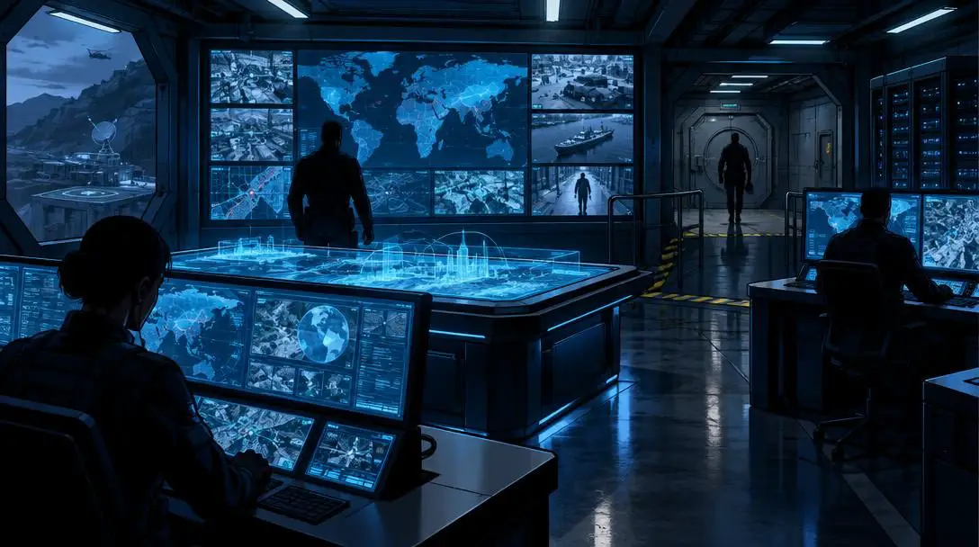
Warm color palettes—dominated by reds, oranges, and vivid yellows—elevate the visual temperature of a scene. These shades naturally trigger feelings of urgency, heat, conflict, and physical danger. An action sequence bathed in crimson immediately communicates high stakes and kinetic intensity. In contrast, cool color palettes composed of deep blues, teals, and muted greens evoke calm, mystery, clinical detachment, or quiet sorrow. Shifting a sequence from a warm palette to a cool palette offers visual relief, signaling to the reader that an immediate threat has passed and contemplative pacing has returned.
Beyond setting mood, color is an indispensable tool for character differentiation. In dynamic battle scenes or crowded ensemble sequences, identical line weights and overlapping figures can quickly confuse the reader. By assigning signature hues to major characters, illustrators maintain visual clarity. Distinctive color blocking allows the reader to track individual silhouettes and follow physical choreography even when figures are cropped, cast into silhouette, or viewed from extreme perspective angles.
| Palette and Lighting Style | Primary Tonal Characteristics | Emotional Tone | Ideal Sequential Application |
|---|---|---|---|
| High-Intensity Warm Palette | Vivid reds, saturated oranges, sharp yellow highlights | Excitement, aggression, panic, kinetic urgency | Explosive action sequences, combat, fire scenes |
| Low-Saturation Cool Palette | Muted indigos, slate blues, desaturated forest greens | Tranquility, melancholy, tension, isolation | Night scenes, post-battle aftermaths, detective investigations |
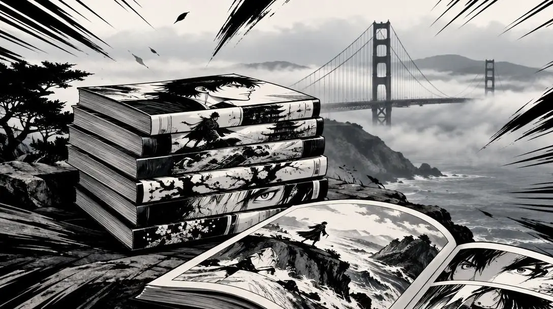
| Chiaroscuro / High-Contrast | Deep black shadows, sharp stark edge lighting | Suspense, moral conflict, mystery, fear | Crime noir, psychological horror, villain reveals |
| Soft Diffused Illumination | Gradual tonal transitions, low contrast, gentle pastel tints | Intimacy, romance, peaceful reflection, safety | Character dialogue scenes, domestic settings, dream sequences |
The mechanics of lighting: volume, mood, and atmosphere
Sequential art begins on a completely flat surface. The illusion of physical weight, solidity, and spatial depth must be constructed entirely through rendering. Lighting is the primary mechanism that brings three-dimensional form to line work, turning flat silhouettes into tangible volumes that appear to occupy genuine space.
The intensity and quality of light dictate how a scene feels before a single word of script is digested. Harsh directional lighting creates stark, hard-edged transitions between light and dark. When deep shadows obscure portions of a character's face or conceal corners of an environment, the unseen areas naturally provoke apprehension and curiosity. This approach is fundamental to suspenseful narratives, horror comics, and gritty urban mysteries, where the environment itself feels hazardous.
Conversely, soft, diffused lighting eliminates sharp edges in favor of gradual value transitions. When ambient illumination spreads evenly across an environment, forms feel rounded and approachable. This soft rendering produces an inviting, intimate, or melancholic atmosphere, ideal for introspective conversations and tranquil pauses between major narrative climaxes.
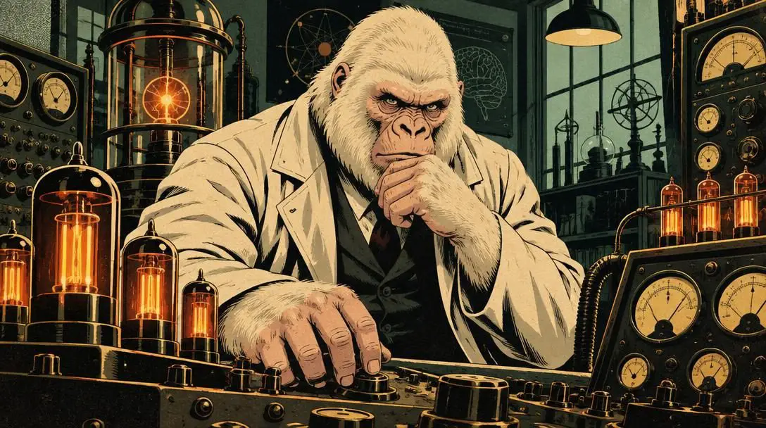
When light hits an object, it alters that object's perceived local color. A white costume viewed under a crimson flare turns red, while a green environment viewed under an amber sunset shifts toward warm olive tones. Mastering lighting requires an understanding of how light sources tint the scene, bounce off secondary surfaces, and cast colored shadows into surrounding areas.
Color and lighting are not merely ornamental touches added after line art is finished, but fundamental storytelling devices that govern pacing, depth, and emotional weight.
Navigating the page: visual hierarchy and reading flow
In sequential illustration, visual design must function across two distinct dimensions simultaneously: within the individual panel and across the full multi-panel page layout. Because comics rely on sequential reading, artists use light and color as navigational beacons to guide the reader's eye smoothly through the narrative sequence.
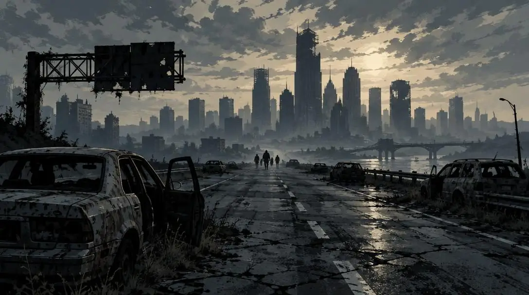
The human visual system is wired to seek out areas of highest contrast. An artist can direct immediate attention to a crucial narrative clue or an emotional facial expression by placing the sharpest value contrast—or the most saturated color accent—directly on that element. If an entire panel is cast in desaturated blue-gray shadows, a single burst of warm yellow light instantly commands priority.
On a macro level, illustrators use light and color to establish a rhythmic reading path. Western comics are read from upper-left to bottom-right. By placing rhythmic accents of brightness or vibrant hues along this diagonal trajectory, an illustrator gently guides the viewer through the intended sequence of panels, preventing the eye from wandering aimlessly or skipping ahead to a climactic reveal. Furthermore, balancing tonal values across the entire page prevents the spread from feeling visually lopsided or top-heavy.
Separating the foreground, midground, and background planes also relies on atmospheric value control. Applying aerial perspective—the natural phenomenon where distant objects appear lighter, less saturated, and lower in contrast due to atmosphere—ensures that background details stay unobtrusive. This separation keeps the primary characters readable and prevents intricate environmental line work from cluttering the panel.
A step-by-step workflow for coloring and lighting sequential art
Developing a dependable color and lighting pipeline is essential for sustaining consistency across hundreds of comic pages. Whether working in traditional inks and gouache or utilizing digital painting suites, sequential illustrators typically follow a methodical production process.
- Establish the narrative requirements: Carefully evaluate the script to determine the scene's physical setting, time of day, weather, environmental light sources, and dominant emotional tone before choosing any colors.
- Define the primary light sources: Identify the specific location, angle, color, and intensity of all key lights in the scene, such as direct overhead sunlight, a bedside lamp, a blazing fire, or a glowing handheld device.
- Block in flat base hues: Lay down the local colors for all characters, costumes, props, and architectural elements without adding any shading or gradients, establishing recognizable identities and palette harmony.
- Determine value structure and cast shadows: Establish the light-to-dark value scale by carving out primary shadows, deciding whether the sequence demands sharp, graphic cut-shadows or softer value transitions.
- Apply specular highlights and bounce light: Add sharp highlights to denote surface textures such as metal, glass, or skin, and paint secondary bounce lighting where illumination reflects off floors or walls into shadowed areas.
- Harmonize with an atmospheric wash: Overlay a unified color wash across the entire panel or page spread to ensure that characters, props, and backgrounds appear to inhabit the exact same luminous atmosphere.
- Review the complete page spread: Zoom out to evaluate the full layout as a single visual composition, checking that the visual hierarchy flows logically and that the narrative beat lands with maximum impact.
Common coloring and lighting pitfalls to avoid
Balancing color harmony and dynamic lighting requires discipline. Novice illustrators often fall into several predictable traps that compromise visual storytelling and reader clarity:
- Overusing high saturation: Treating every element on the page with full, brilliant saturation overstimulates the reader. When background scenery, costumes, and props all scream for attention, visual hierarchy collapses and eye fatigue sets in rapidly.
- Inconsistent light sources: Shading a character from the upper left while nearby architecture casts shadows toward the left reveals a broken spatial logic. Unless multiple defined light sources exist, lighting angles must remain mathematically consistent across all panel elements.
- Relying on flat shading during dynamic action: Kinetic combat and physical movement require pronounced contrast to communicate kinetic impact and weight. Overly gentle or flat rendering saps the power from an otherwise well-drawn action sequence.
- Ignoring the underlying value structure: Selecting colors purely for their aesthetic appeal without checking their relative lightness and darkness yields muddy, unreadable panels. Value contrast does the heavy lifting of readability; color simply enhances it.
- Disconnecting characters from their backgrounds: Rendering a character with warm, bright daylight highlights while dropping them onto a cold, rainy nighttime background creates a jarring "cut-and-paste" visual disconnect that shatters reader immersion.
Format, pacing, and macro-level visual planning
Applying color and lighting effectively requires thinking beyond individual panels to consider the overarching architecture of a complete book. Translating conceptual visual designs into successful sequential storytelling demands careful consideration of reproduction formats and long-term narrative pacing.
One critical technical consideration is the difference between digital displays and physical printing. Modern digital devices feature backlit screens that emit light, making vivid colors appear luminous and saturated. Physical print, however, relies on reflective ink on paper stock. The absorption properties of paper, combined with the limitations of CMYK printing gamuts, compress dynamic range and darken shadows. Illustrators designing for print must calibrate their shadows to avoid losing intricate linework in heavy black ink pools, while artists publishing for digital webtoons must account for vertical scrolling and varied screen calibrations.
Furthermore, color and lighting serve as structural pacing devices across multi-issue story arcs. An illustrator can visually mirror a protagonist's narrative journey by gradually altering the global palette from chapter to chapter. A storyline that begins in a bright, sunlit town can slowly desaturate and darken as the central mystery deepens, culminating in high-contrast, shadowed environments during the story's darkest psychological turning point. When the resolution arrives, introducing warm dawn hues delivers a visual and emotional catharsis that written text alone cannot replicate.
Ultimately, developing an authoritative visual voice in sequential art involves balancing time-tested traditions with personal experimentation. Studying cinematic cinematography, classical master painters, and natural lighting phenomena provides an endless well of practical insight. By understanding how light behaves in three-dimensional reality, an artist can bend and stylize color conventions to craft comic pages that resonate deeply with readers.
Frequently asked questions
Why were early comic book superheroes primarily colored in bright primary hues?
Early comic books were printed on inexpensive, porous newsprint using high-speed four-color rotary presses with limited color gamuts. Vibrant primary colors like red, yellow, and blue ensured that central characters remained easily recognizable and readable despite low-grade paper, ink bleed, and imperfect print alignment.
How does lighting establish three-dimensional depth on a flat comic page?
Lighting reveals volume by dividing objects into planes of light, midtone, and cast shadow. By carefully rendering specular highlights, core shadows, and reflected bounce light, an illustrator creates the optical illusion of curvature, mass, and tactile surface texture on a two-dimensional sheet.
What is bounce light and why is it important in comic art?
Bounce light, or indirect ambient light, occurs when illumination strikes a primary surface and reflects softly onto nearby shadowed areas. Including bounce light prevents shadows from looking like flat, lifeless black patches and visually anchors characters into their surrounding physical environments.
Why is value structure more important than color choice for panel legibility?
Value refers to the relative lightness or darkness of a shape independent of its hue. Because human vision relies primarily on tonal contrast to distinguish shapes, edges, and spatial depth, a panel with a sound value foundation will remain crisp and readable even when viewed in black and white.
How does coloring for physical print differ from coloring for digital screens?
Digital screens emit light, allowing for higher contrast ratios and radiant, luminous hues. Physical printing uses ink that absorbs ambient light, which narrows the visible color gamut and often darkens deep shadows. Illustrators must account for ink absorption and paper quality to ensure their panels do not print too dark.
The bottom line
In comic book illustration, color and lighting are not superficial layers applied after the drawing is complete; they are vital storytelling languages that shape the medium's emotional and spatial reality. By mastering value structure, understanding atmospheric light behavior, and respecting the reading flow across the page, illustrators can elevate sequential art from a series of static drawings into an unforgettable narrative experience.